Themeforest

Tips: Case Study

From lo-fi wireframes to branded high-fidelity mockups for a hospital system.

About the project

The client (the hospital’s IT team) needed a clear interface to register new patients and search existing patients. Core goals:

  • Reduce data-entry errors with a guided 4-step flow.
  • Respect the hospital’s visual identity (D-DIN type, color palette, CTA hierarchy).
  • Ensure accessibility and legibility across long forms.
  • Include critical components: date-picker, validations, left navigation, final confirmation.
Role

Product Designer / UI

Deliverables

Wireframes, Design Guide, Mockups

Stack

Figma, Bootstrap, GLightbox


Design decisions (driven by client needs)

  1. Step flow (1–4): lowers cognitive load and improves data quality (Personal → Address/Contact → Basic clinical info → Confirmation).
  2. Left navigation: keeps context (“where am I?”) without pulling focus from the form.
  3. D-DIN & brand palette: technical clarity and consistency with the hospital’s identity.
  4. CTA hierarchy: clear Primary / Secondary / Cancel to prevent errors.
  5. Form components: date-picker, grouped fields, validations, and success states to build trust.
  6. Accessibility: contrast, sizes, and keyboard focus considered from the wireframe stage.
View:

Process

1) Wireframes

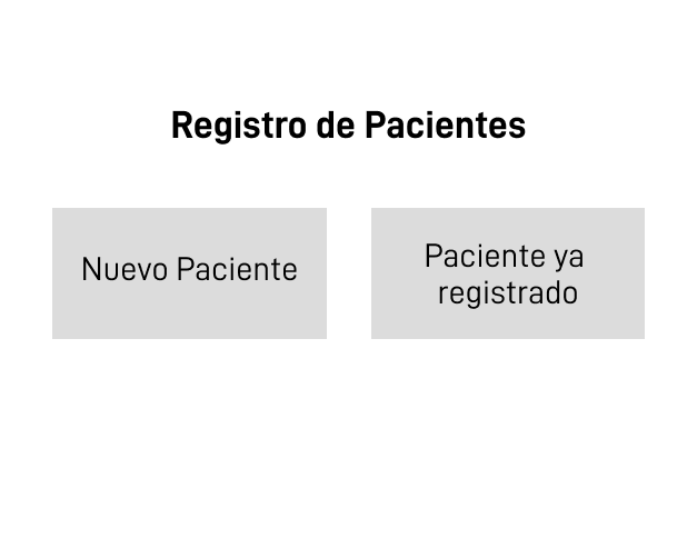
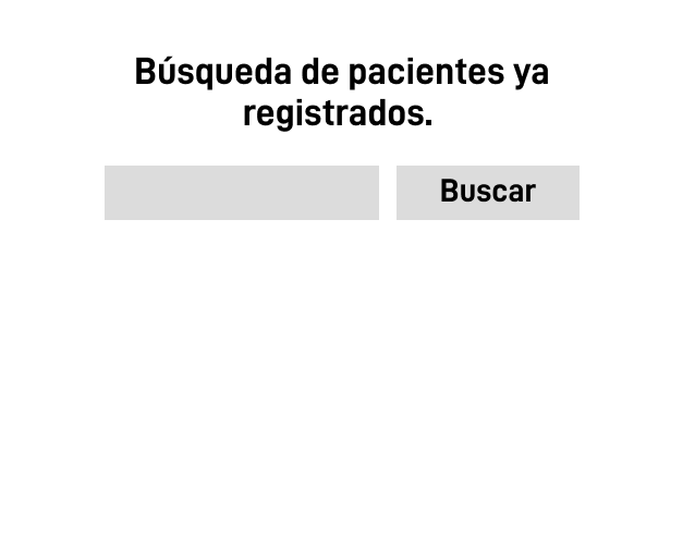
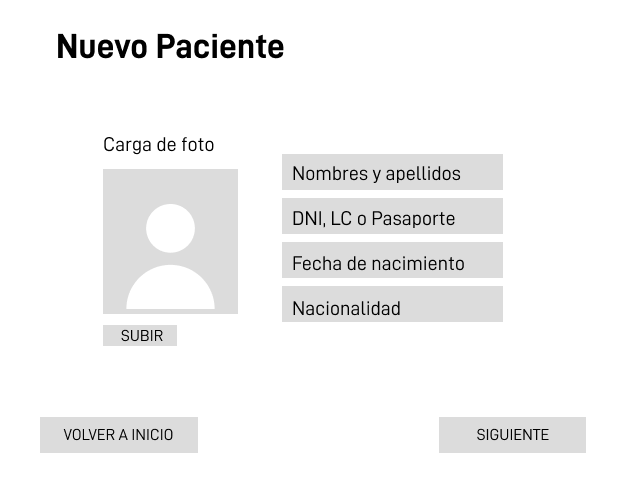
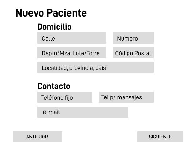
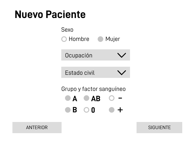
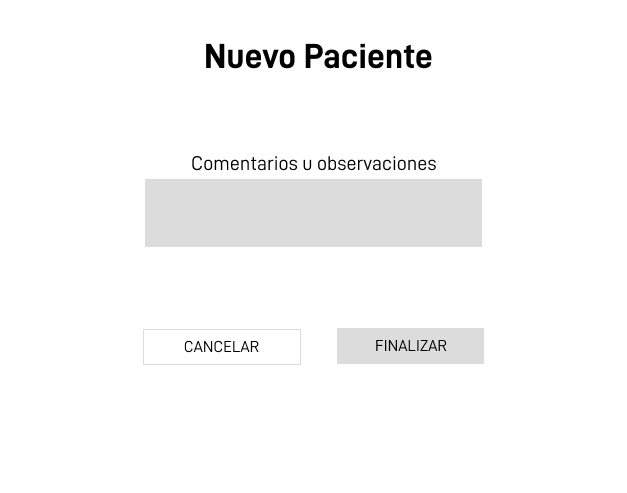
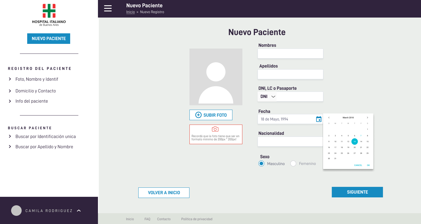
I began with grayscale wireframes (Frame 1, 3, 7, 8 and Steps 1–4) to validate information architecture, field order, and micro-flows (upload photo, date-picker, validations). This let the clinical team react early without being biased by colors.

2) Design guide

I defined the visual guide with D-DIN (Bold for headings, Regular for body), the institutional color palette, and CTA states (primary, secondary, cancel). The guide ensures consistency and reduces implementation ambiguity.

3) High-fidelity mockups

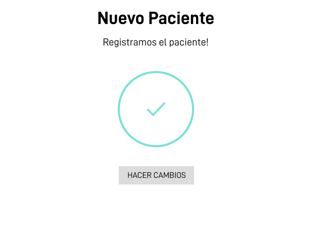
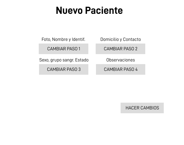
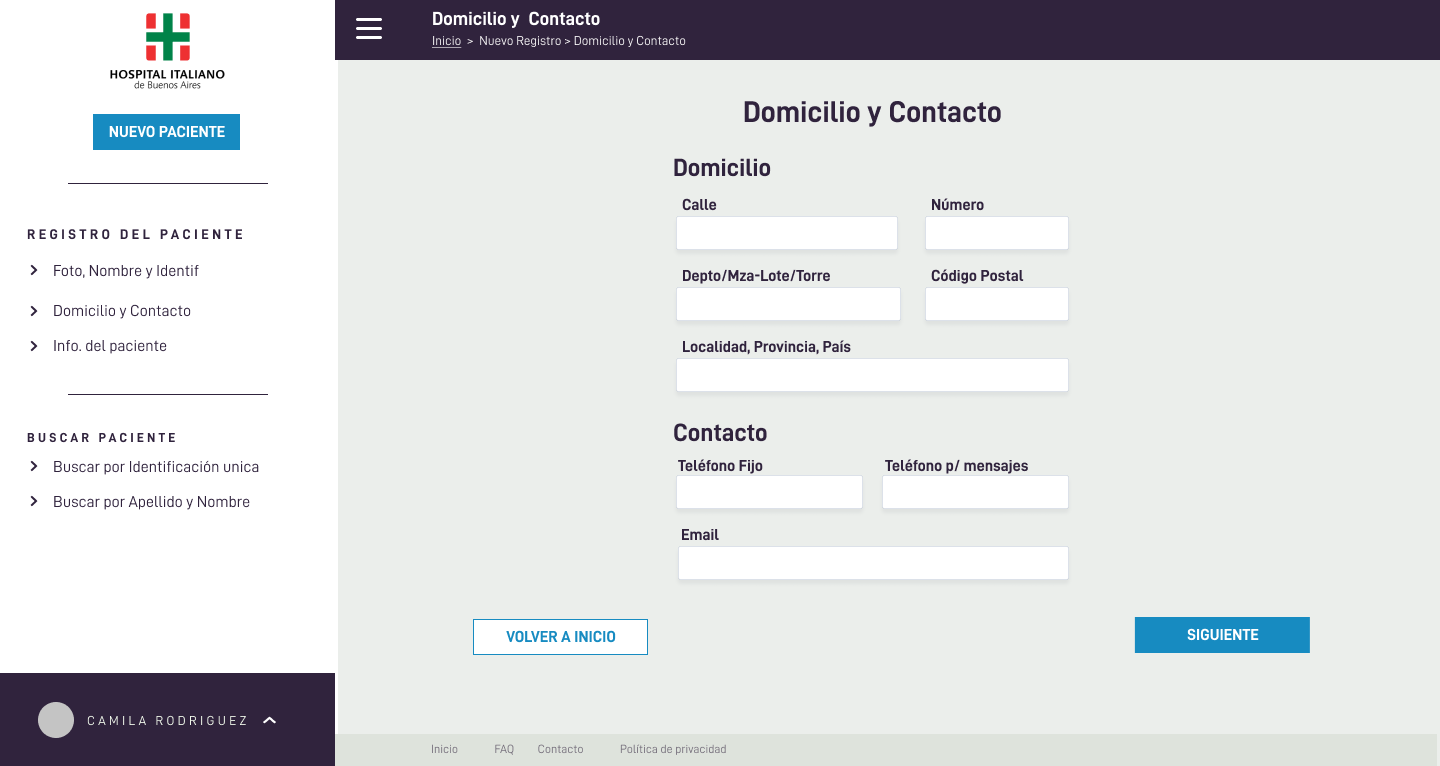
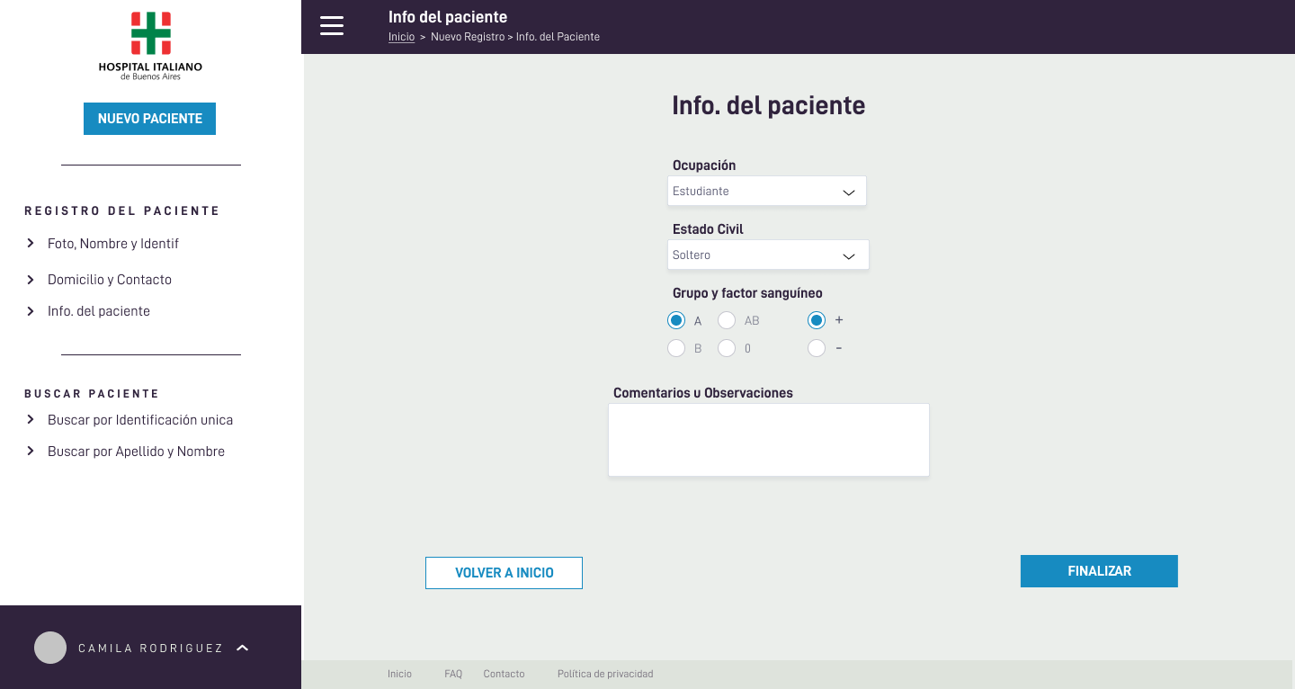
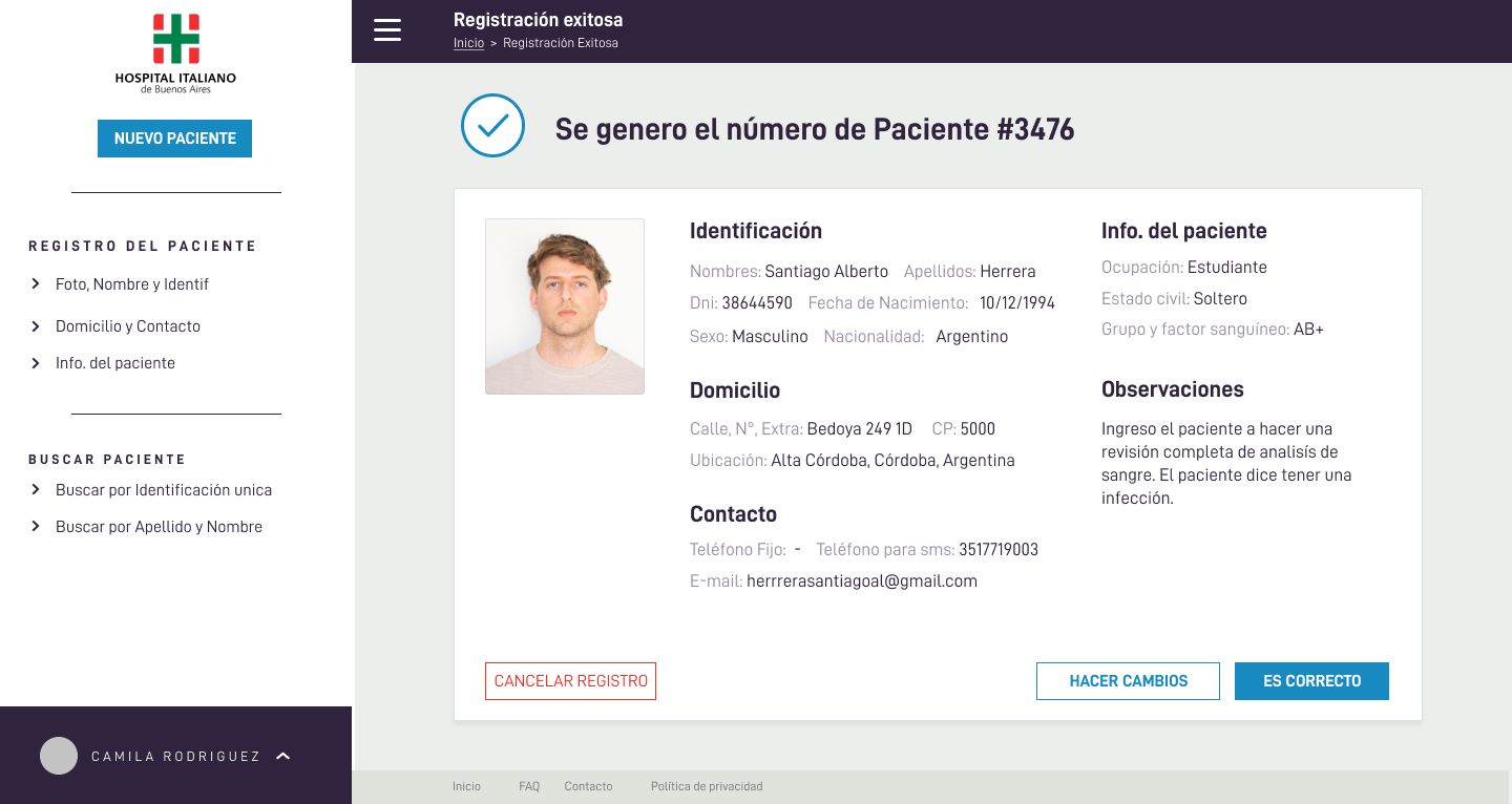
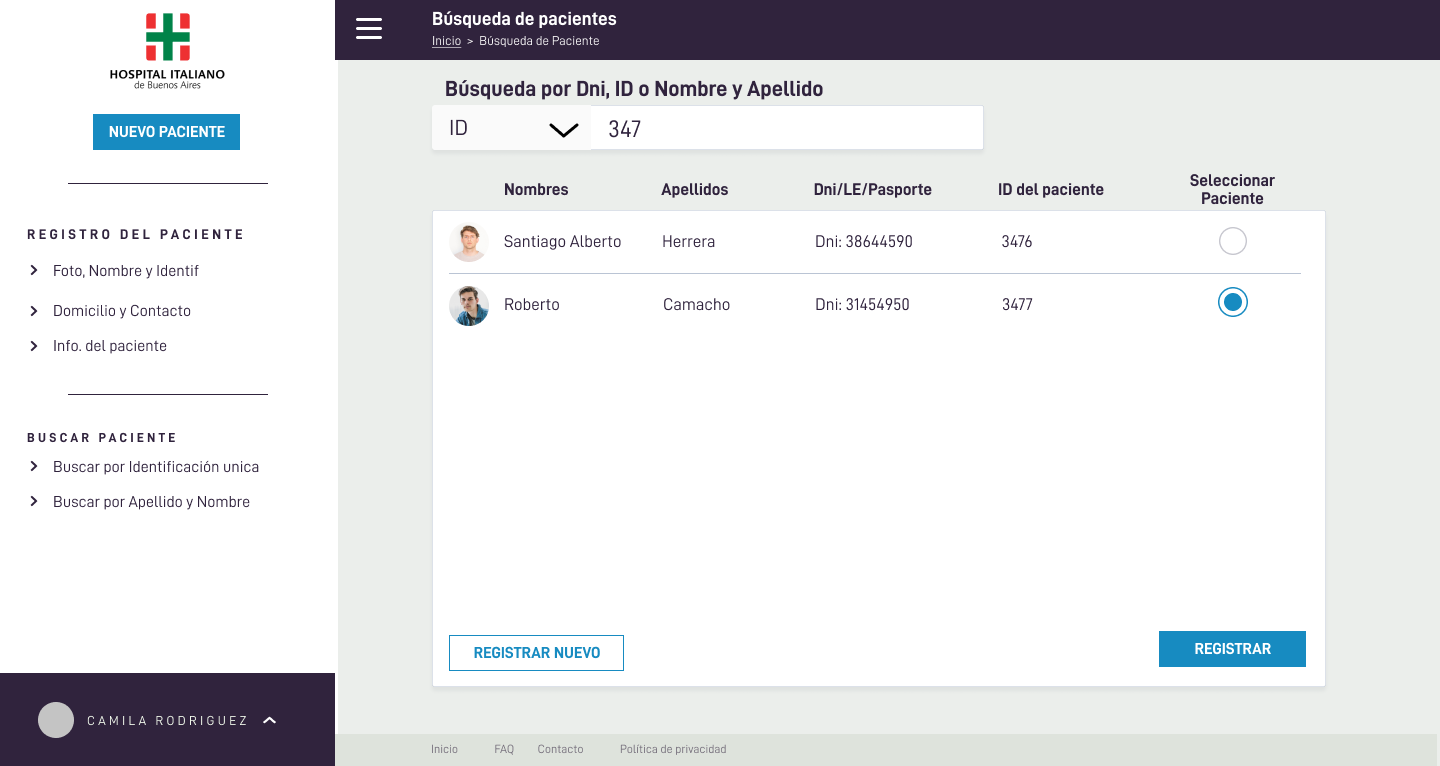
I applied the guide to the final layout: contextual left navigation, step-by-step forms with immediate feedback, clear CTA hierarchy, and a final summary to confirm sensitive data before saving. The Search screen covers the other key client scenario: finding existing patients quickly with simple filters.

Outcome: a guided, brand-consistent experience designed for speed, fewer errors, and easy staff adoption.