
EntreVecinos was born from a very specific problem: gated communities are full of people who live physically close, yet coordination, trust, and help still happen in fragmented and inefficient ways. WhatsApp groups exist, but they lack structure, continuity, and accountability.
This article explains why each design decision in EntreVecinos was made, starting from the earliest wireframes to the final UI direction. Every screen, flow, and interaction was designed to reduce friction, increase trust, and feel human rather than transactional.
Typography across the product uses Plus Jakarta Sans, chosen for its balance between friendliness and clarity, reinforcing the informal but reliable tone of the app.
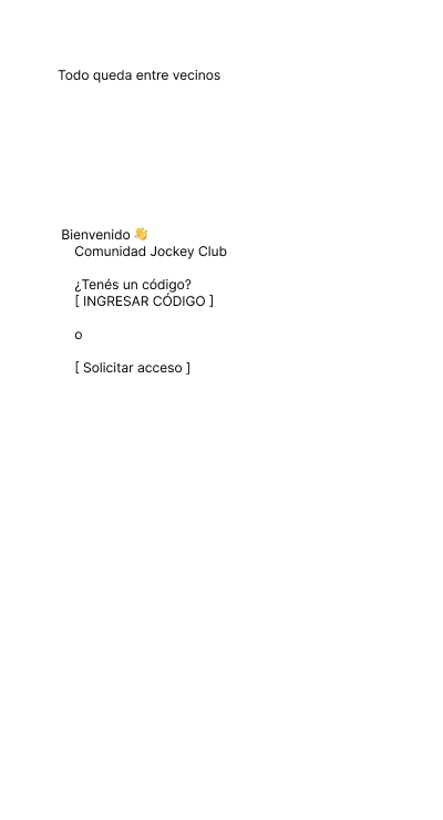
The very first screen introduces the core idea: "Todo queda entre vecinos". This is not a slogan; it is a contract. From the first interaction, users understand this is not a public marketplace.
Instead of open sign-ups, access is gated by invitation codes or access requests. This immediately filters intent and sets expectations. UX-wise, this reduces anxiety and reinforces the idea of a private space.
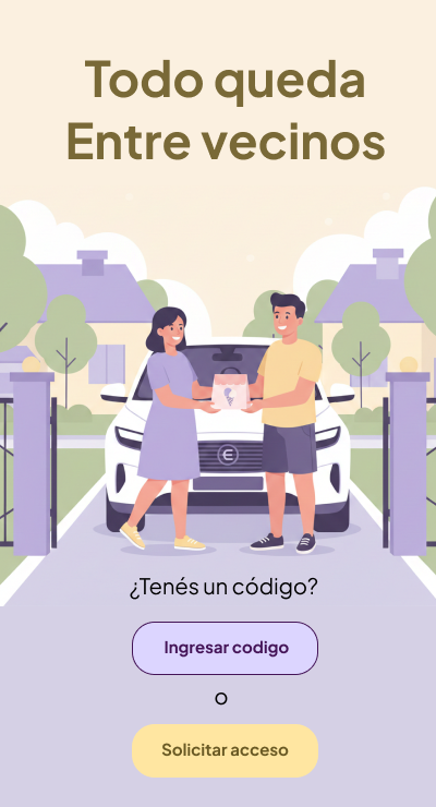
The illustrated onboarding reinforces warmth and community. Visual storytelling is used early to replace long explanations. Seeing neighbors interacting communicates more than paragraphs of copy ever could.
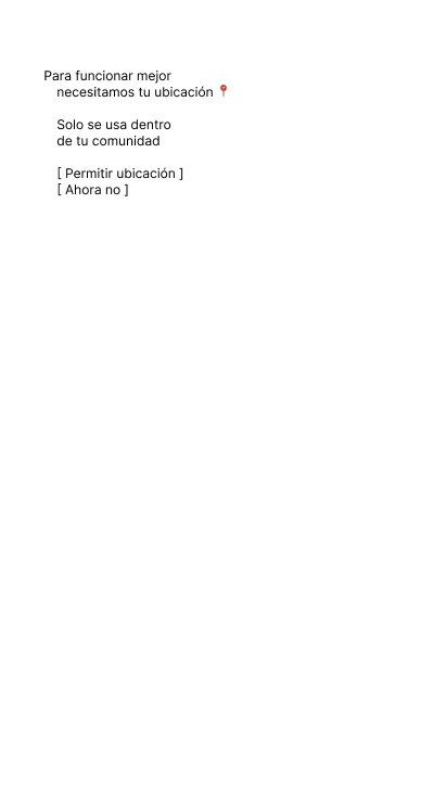
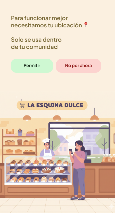
Location permission is framed as a requirement for trust, not surveillance. The copy explains clearly why it is needed and limits its scope: the app only works inside the community.
This design decision protects the mental model of the user. EntreVecinos is not tracking movement; it is validating belonging. The UX choice to explain this before requesting permission significantly increases acceptance rates.
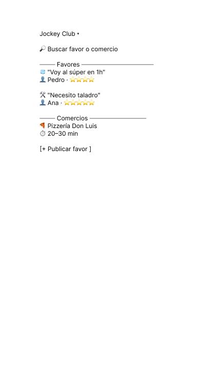
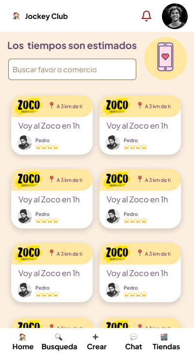
The Home screen answers one question: "What is happening right now in my neighborhood?"
This is why Home is feed-based. It surfaces real-time actions such as "I'm going to Zoco in 1 hour" or "Need a drill." The goal is passive discovery, not searching.
Explore, on the other hand, is intentional. It exists for users who already know what they need. Separating these mental modes avoids cognitive overload and keeps the UI predictable.
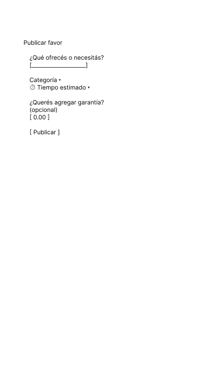
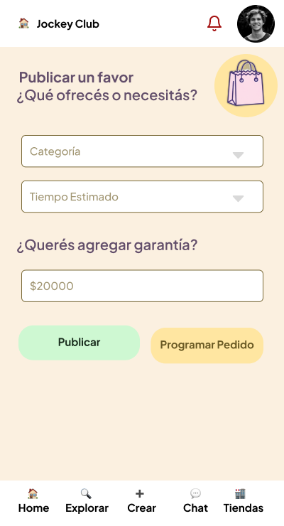
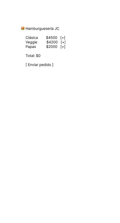
Publishing a favor is intentionally lightweight. The form asks only what is essential: category, estimated time, and optional guarantee.
Guarantee is optional by design. Forcing monetary commitment would increase friction and discourage spontaneous help. UX here prioritizes participation over perfection.

Before any chat becomes active, there is a clear agreement summary. This screen formalizes expectations: who, when, what, and how much.
This design prevents misunderstandings later. UX research consistently shows that conflicts happen when expectations are implicit. EntreVecinos makes them explicit early.
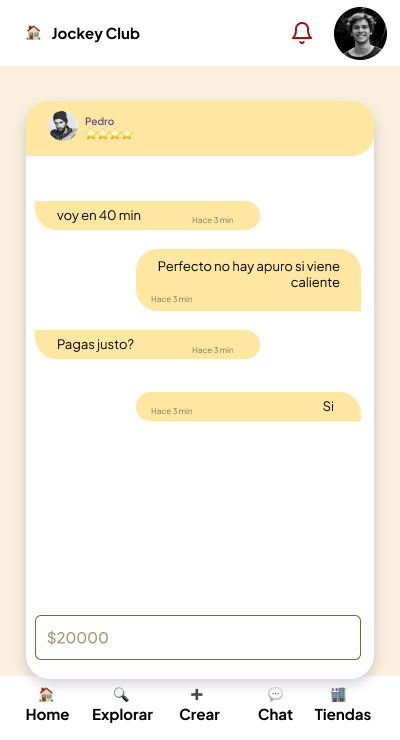
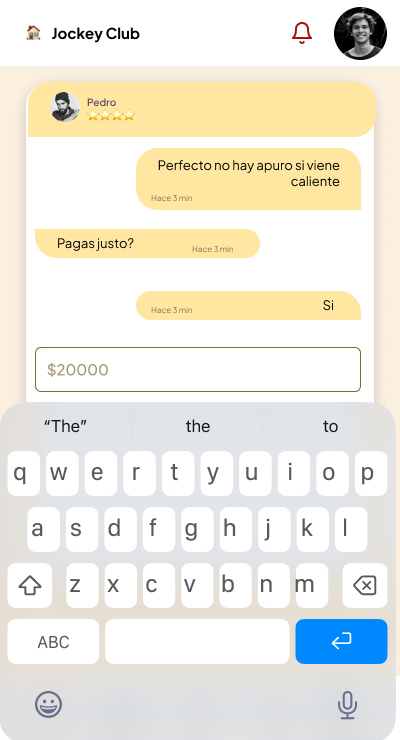
Chats in EntreVecinos are contextual. They are not free-form rooms but extensions of a specific agreement.
This design reduces noise and emotional friction. Messages are short, purposeful, and anchored to a shared context. The chat UI visually reinforces this by keeping the agreement visible and limiting actions.
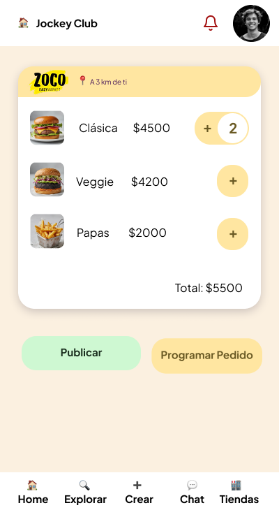
The store experience borrows familiar patterns from delivery apps, but with a critical difference: no commission per transaction.
Local businesses pay a fixed fee for visibility. UX-wise, this removes price anxiety for users and aligns incentives for merchants. The cart UI feels familiar, reducing learning curves.
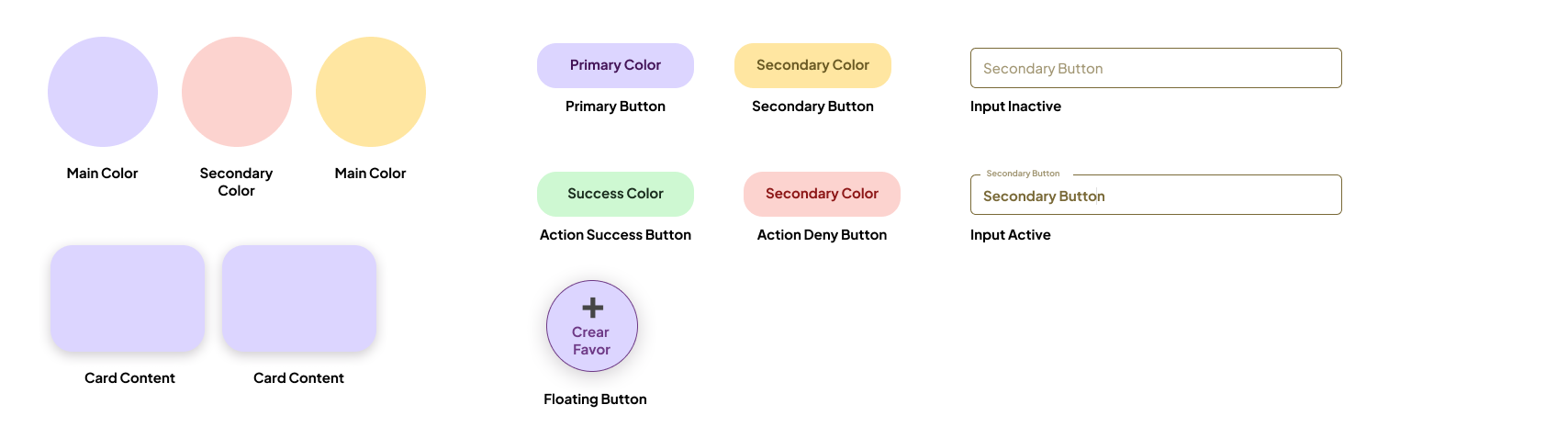
The UI avoids aggressive contrasts and sharp edges. Rounded components, warm colors, and soft illustrations communicate safety and familiarity.
Buttons follow a clear hierarchy:
This consistency builds trust over time. Users always know what will happen when they tap.
Storybook is a natural fit for EntreVecinos because the product relies heavily on reusable, stateful components.
Using Storybook allows designers and developers to:
In a trust-based product, visual regressions are not cosmetic bugs. They are credibility risks. Storybook helps prevent that.
EntreVecinos is not designed to move fast or optimize for volume. It is designed to feel safe, familiar, and predictable.
Every UX and UI decision reinforces one idea: helping each other should feel natural, not transactional.
That is why the product looks the way it does, behaves the way it does, and says only what is necessary.
Because in the end, everything really does stay between neighbors.